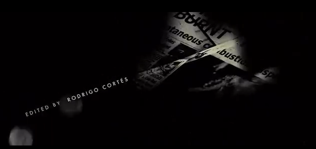
This is our evaluation of our final draft of the title sequence "Waiting"
http://www.youtube.com/watch?v=3BpOWMBbWwA&feature=youtu.be
All images used in the video are from Google.
Thursday, 28 March 2013
Tuesday, 19 March 2013
Waiting final draft
The third and hopefully final draft includes new shots where the girl is
off centre and is walking quite fast paced with specific mise en scene.
The girl has a bag, a necklace, a skirt and we also see her face and
facial expression giving more background and emotion. This draft has
added music with specific music croscendoing and building up to a climax at the end. We have
used opacity more thoroughly and organised the shots so the piece flows
better and it all leads to the climax adding to the tensi0on asnd leaving the audience in suspense. This draft has our desired music,
effective titles and has been edited as well as we think it can be. We
are now waiting to evaluate and get feedback on this final draft.
This is the link to our final version:
This is the link to our final version:
Evaluation script
Script for our evaluation:
Good
morning and welcome to the Media chatshow. AS level examiners recently
have been very interested in the development and production of the title
sequence Waiting produced by Bethany Haigh and Elise Hockridge of the
North Halifax Grammar School. I'm Oscar Charlie Ross and today I have
the pair in the studio to tell us all about their product.
Interviewer: Welcome Beth and Elise!
Hi
Hi
It’s nice to have you here! So, get us started – in what ways does your media product use, develop or challenge forms and conventions of real media products?
We adhered to usual conventions by choosing rural, urban and very isolated location to make it seem deserted and hard to escape from. We have only included one character in the sequence that you can see and the second character is not visually revealed this is also common amongst horror and thriller films as this makes the audience feel as though they are aware of what is going to happen but the character does not adding an uneasy feel. We used s a lot of POV shots to make the audience see what is happening from the characters eyes whether this be the antagonist or protagonist. This can make the audience feel more involved and connected to the film possibly making it scarier and more uncomfortable. We used this effectively by having one character all POV shots. Props are essential in typical horror or thrillers and in films such as Seven the title sequence is simply props, a strong style model we used. Our frequent use of props, such as fire, were chosen to connote and foreshadow the danger to follow. We particularly liked how some films didnt incorporate the titles into the film but rather had a black screen seperate with writing on. We have used this in our title sequence as it makes it more unsettling and dark. Jump cuts were consistently used in our favourite style models. We found the use of jump cuts makes you constantly wondering what is happening and at times confused, but we liked this effect. We used lots of jump cuts from the two characters to signify journeys they were both on and create an uncomfortable unnerving effect which is a typical feel of thriller and horror title sequences.
We found there is often little sound in the title sequence and the sound that there is is very subtle. This creates a certain atmosphere as it is not overpowering but still significant. We used a creepy music box sound and added this to our title sequence. Typically the title sequences have very obvious or no sound at all but we challenged this and started our title sequence with silence then brought in the music box for the duration until the very end where a sound effect was used for the climax, this seemed to fit well with our content. We also challenged conventions when we used certain props, it is typical to see consistently scary props throughout the title sequence, like the fire we used, but we also decided to include jump cuts of ballet shoes and ballerina figurines, this gave the girl more background and although it is effective to give away little about the characters we felt the background information props helped exaggerate her vulnerability and thus make the overall feel more negative.
Brilliant, brilliant we loved it! So, how does your media product represent particular social groups?
The beginning of our title sequence shows a girl casually dressed in a dress with girly accessories such as a bag and jewellery that make her seem young, stereotypical and possibly innocent. When the audience is introduced to her house as the man is looking around it becomes clear she is of middle class as the house seems larger than average. It is clear by the size of the house and the mise en scene used such as the phone that she is of a middle class family. The cuts to different rooms showing furniture and ornaments such as a ballerina further show her as being girly, it is possible that the audience could connect the girl with the phone and house with the ballerina cuts to see that she is spoilt. However, we didnt want to emphasise this and we wanted to subvert the typical spoilt teenager who gets chased in horror films and make it more that she was vulnerable and we did this with her facial expressions and cuts to the corridors which seem deserted. The links to the large house with the fact that she is vulnerable allow us to appeal to upper and middle class social groups at the same time as they can both relate to these links and appreciate them.
I see, What kind of media institution might distribute your media product and why?
American institutions may appreciate our product as it sticks to typical conventions and promotes possibly wealth teenagers which is common in american horrors such as The Ring which shows wealthy teenage girls who are clearly well off. This seems to be a popular option for american horrors and is also shown in films such as Scream. It is, however, more likely that British insitutions will distribute our product as the links between middle and upper class will be better appreciated by the british audience who can sometimes reject films promoting one class. The subtle links between middle and upper classes give a wider audience, the attraction of the girls vulnerable nature with cuts to her large house show she is not affected by this wealth. It is known that the british audience does appreciate some links to the upper class and do not reject seeing things they may not have such as big houses and wealth so we had to keep particular control over this to ensure the british institutions would be able to distribute our product. The standard conventions appeal to the traditional british horrors that have been widely accepted but the adaptations to a modern interpretation appeal to Film 4 and their appeal to untraditional films that subvert the usual characterisitcs, these usually focus on the urban problems such as Attack the Block.
Who would be the audience of your media product?
We hope to appeal to teenagers and young adults, we hoped to do this by using a young girl who seems quite relatable. Although the girl is fairly stereotypical she seems smiley and friendly which helps the audience connect with her. It is possible our product would attract couples as there is a stark contrast between the girl and the horror side which may be ideal for teenage and young adult couples who could see this together and both see something that would entertain them both. Typical horror/thriller fans and viewers will hopefully be enticed by our film and become a base audience as we have adhered to many conventions of the genre and so they will recognise this and appreciate how this is traditonal with a modern twist. The fact we have incorporated modern traditonal horror/thriller values and combined it with some challenges of conventions will hopefully widen our target audience.
How did you attract/address your audience?
The horror may attract more boys who might be interested in the horror aspect and how this includes the girl more than females, however, it is possible that our breaking down of her character and advertising her vulnerability will make girls embrace her character rather than resist it which can often be found in films where the girl is the main character. We wanted to create a connection between character and audience so they would indulge in her vulnerability and this would make the title sequence more uneasy when it becomes clear that someone is in her house. We subtly added some sexualising of the girl by using opacity to zoom into her necklace which could make boys focus on her breasts. Teenage boys will hopefully be attracted by the girl and this could be the same for teenage girls, young adults that are males may be attracted by the suspicious and mysterious horror aspect and less about the girl.
What have you learnt about technologies from the process of constructing this product?
Well we certainly had a fun ride with all the products. We encountered various problems but these problems in the long term helped our product and made it better. We had the problem of trying to shoot our footage when it was dark and in particular at dusk but this was difficult with the camera as it did not take well to the dimmed lighting and in particular when we tried to shoot in the dark and use a torch the quality of the shots was greatly affected. We had problems with the sound as we wanted to use the sound of the cutting and ripping pictures along with the striking of the match but this was difficult if there was any background noise. It was nearly impossible to add sound effects to the correct speed so we re-shot and used a quiet room with the camera close to the prop and finally got sound we could use from the actual footage. We also were very keen to emphasise how the two characters were doing things at the same time, as the girl was walking to the house the other person was already there. Split screen made the title sequence too cheesy and it didn’t seem believable so after playing around on sony vegas we found that you can use opacity to have two shots going along at the same time. This was very very beneficial to our piece and became the prominent editing feature. We also learnt how to do jump cuts by stuttering the footage which can make the footage seem more on edge and confusing which worked perfectly with the atmosphere we hoped to achieve. We also learnt lots about sound and how different pieces of music can alter the feel of the product all together, after experimenting on sony vegas we found that we can chop parts of the music up to relevant parts of the footage and this became invaluable as we had various moments of increased tension and the climax.
Looking back at your preliminary task, what do you feel you have learnt in the progression from it to the final product?
We have certainly learnt that the most important thing is planning. On our first shoot we had poor shot lists and we hadn’t even devised a storyboard. We had concepts in our head that we hadn’t applied to actual reality, we hadn’t even considered whether our actors would be available and if they would be able to film at the certain time of day. Without a shot list and thorough planning of props we were flawed as our material was inconsistent and the improvisations we had to use due to poor planning came across in the product. We have learnt that a simple concept and idea can be more effective than one with a really complex storyline, we were quick to have ideas and after watching style models we wanted to include everything we liked from every style model in our one product, this did not work and made the title sequence lack consistency. Our simple idea of a girl walking home from school whilst someone was in her house was our least favoured idea but when we realised how our previous experiments had been flawed by too much going on, we gave this idea a go and realised we could add things to a simple idea to make it better and more effective without having a dramatic and over the top concept. We have learnt that editing is such a huge part of the process and found that lessons devoted to just getting used to and testing out sony vegas paid off in the long run although it felt like we weren’t getting anywhere when we wanted to apply our skills it was easier and our editing could take place without being halted for the learning of new skills. Sony vegas transformed our average footage with little atmosphere or feel into a tense and on edge minute and half of film. The adding of sound, jump cuts, titles and opacity turned our product into everything we hoped for we felt like we had used typical conventions whilst also adding a modern personal spin on things with the incorporation of our new found skills.
Editing

Here is an early print screen of us editing our product. Just after this
we replaced all the shots of the girl in the white dress with a more
casual outfit and in daylight. You can see the stuttered shots were we
have included flashes to certain things and shots in Video Overlay where
we have used opacity. At this point we had no sound and were working
solely with the footage.
Opacity
When we were planning our piece and thinking of concepts we really
warmed to the idea of two things happening at once. This was probably
because in previous projects our best skill was split screen, we liked
the idea of two things happening at once and them both coming to a point
where they meet. Like Love Actually at the end. We found that split
screen seemed unprofessional and didnt get across the feel we wanted to.
Seconds before we lost our temper with sony vegas we were revealed to
the most invaluable piece of information throughout the whole process -
Opacity. This brilliant feature transformed our piece and gave it
everything we wanted. The ability to position two pieces of footage at
the same time showed the audience that these two things were happening
at the same time and built the suspense of the ending up perfectly.
Varying percentages allowed us to show things that were more important
such as the ballet shoes whilst the girl was walking in the background
subtly. Below are some examples of opacity doing its thing in our
product.


Thursday, 14 March 2013
2nd draft
After the feedback from the target audience we deicided to refilm the girl waling so it was in the daylight and she was wearing a dress and looking more girly rather than scary. This would ake it more understandable for the audience as it is now clearee that she is innocent and the man in her house is portrayed as the scary character.
Wednesday, 6 March 2013
Monday, 4 March 2013
Feedback
First draft feedback
We showed the first draft of our title sequence to the class and asked them for feeback on what was good and what we could improve. We prepared six questions to ask them which were:
- Do you understand the concept?
- Would you add eerie/diagetic/or ironic music/sound?
- Do you think our change in genre has made our piece better?
- Do you think the quick cuts are effective?
- Do you feel confused or on edge?
- Do you think the titles fit?
Everyone agreed that this title sewunce was vastly improved from our previous one as it showed better editing skills and followed a genre better. As we haven't yet added sound people suggested that we should use eerie music to add to the suspense and tension along woth diagetic sound of the maych lighitng and maybe heacy breathing in the background as the man is looking around the house. Our fast cuts and cuts to the titles were particularly liked as they added tension and biult up to the climax of the extremely fast cuts at the end. The main critisisms we received was that the concpet was hard to understand. Even though we do want it to be a mystery and for the audience to be confused, many thought the girl looked scary because it was shot in the dark and she was wearing a white dress and black boots, wheras we wanted her to look more vulnerable. We have decided to re shoot the parts of the girl walking concentrating on mise en scene such as jewellery, phone and a dress to make her seem more girly and vulnerbale. We are also going to have some shots showing her face rather than not seeing her face at all as some people thought there was too much mystery.
mid-editing
So far...
So far we have filmed the shots we need and are have edited our first riugh draft. It begins with a girl walking which cuts to the man looking around the inside of her house. There are constant cuts and fades between the girl walking home and the man inside the house doing various different things to create suspense and mystery. There are different shots of the man looking around her house, cutting up photos of her, burning photos of her and pinning photos of her on a board. This creates confusion for the audience as to what he is doing there and builds up to the climax at the end. All the way throuigh the title sequence there are flashes and cuts to a black screen with the titles in white writing. this makes it seem as though the film is breaking up and again adds to the mystery. It ends with extremely fast cuts between many shots of the girls hand as she is opening the door to her house and different shots of things the man was doing inside the house. This leaves the title sequence on a climax and leaves the audince wondering what is going to happen in the film.
Thriller genre research
Research
Conventions of a thriller:
Theconventions of the thriller genre are to do with sound and editing.
eg quick cuts and camera angle changes and music that gives tension and when appropriate. Lighting and the use
of shadow. mirrors and stairs are also conventions of thriller movies.
A thriller provides the sudden rush of emotions, excitement, sense of suspense and exhilaration that drive the narrative, sometimes subtly with peaks and lulls, sometimes at a constant, breakneck pace thrills. In this genre, the objective is to deliver a story with sustained tension, surprise, and a constant sense of impending doom. It keeps the audience cliff-hanging at the "edge of their seats" as the plot builds towards a climax. Thrillers tend to be fast-moving, psychological, threatening, mysterious and at times involve larger-scale villainy such as espionage, terrorism and conspiracy.Thrillers may be defined by the primary mood that they elicit: fearful excitement.
Taken from: http://en.wikipedia.org/wiki/Thriller_%28genre%29
Risk assessment
Risk Assessment
|
Risk
|
Risk (high, moderate, low)
|
Measures already placed
|
Persons affected
|
Other information
|
|
Sharp objects (scissors and pins to stick photos on board)
|
Moderate
|
Safe scissors and pins to be used.
|
actor
|
The actor will be wearing gloves to add to the mystery of the man so
this will prevent any possible injury.
|
|
Shooting in the dark
|
low
|
All obstacles that could cause a fall moved out of the way.
|
actor
|
A torch will be used to make it easier to see.
|
|
Fire (lighting a match and burning photos)
|
High
|
|
Actor and film crew
|
The picture will be burnt near a sink so it can be thrown into the
sink with water. The gloves will also be worn which are fire resistant.
|
Thursday, 28 February 2013
Red lights analysis
Another title seuqence we looked at of the thriller genre was Red Lights. The link to this is below:
http://www.youtube.com/watch?v=SFkDfbkOwyo
 This title sequence seems quite simple but effective. The music immediateley sets the mood as it has a fast tempo and seems quite scary. It begins quite loud and constantly changes tempo switching from stoccato to legato while also changing volume, this will keep the audience on edge and wondering what is going to happen. The audience is first shown a black screen with white lights which creates mystery and is also ironic as the film is called red lights. It then becomes apparent to the audience that these white lights are shown continuosly throughout the sequence.
 These lights then tuen into the titles which are shown in white writing on a black bakground the whole way through. This seems simple but works for this genre as it keeps it mysterious and not too colourful and happy. We have used this idea for ours by having the titles flashing up in white writing on a black screen to add to the tension and unease of our target audience. In this sequence the font of the titles is quite plain but they appear and disappear randomly with different affects added such as one word at a time going and fashing on and off. This puts the audience on edge and works with the horror/thriller genre as the audience don't know what is going to happen next.
 The whole sequence is in black and white which make it mysterious as the audience don't know why. It also adds to the eerieness as bright colours woukld make it seem more happy and would deteriorate from the titles and the close ups of different things shown. We used this idea in ours to a certain extent, we did use colour but added effects to make it darker as we thought this worked better than just using black and white for our title sequence. In this title sequence the black screen is also shown all the way through with close ups of different things appearing all the time.
 The red lights that appear while the title of the film is being shown are the only thing that is in colour. This again adds mystery for the audience as they will stand out and they will want to know what significance these red lights have in the film. It will also make the title stand out as the title is 'red lights'. The colour red connotes danger so these red lights appearing may show the audience that something bad is about to happen.
 At the beggining of the sequence little is shown and it is always close ups but throughout there are more and more things shows and there are the whole of thing shown so it becomes more apparent to the audience what is happening and what the film is going to be abouut. It also becomes lighter towards the end with more white being shown rather than black adding to the mysteriousness.
 The sequence ends quite suddenly. The tension has beein built up by the crescendo of the music and the fast paced cuts and the audience are in suspense and mystery wondering what is going to happen. The music fades out and it cuts into a plane flying ready for the film to start which contrasts with the rest of the sequence as it seems quite normal sanf this is now in colour rather than black and white.
http://www.youtube.com/watch?v=SFkDfbkOwyo


se7en analysis


Tuesday, 26 February 2013
Shot list
In the house
Burning photograph MEDIUM/CLOSE
Cutting photograph CLOSE
Ripping Photograph down the middle CLOSE
Pinning Photos onto board MEDIUM
Close up on photos on board (scanning) CLOSE
Walking up stairs showing balcony POV
Walking downstairs scanning towards door POV
Walking through corridor numerous ones to juxtapose together POV
Looking round room focus on ballet shoes, ballerine figurine POV/MEDIUM TO CLOSE
Looking out of window POV
Looking at the door POV
With the girl
Walking along from side MEDIUM
Walking from back WIDE
Getting phone out of bag CLOSE
Looking at phone CLOSE
Walking on the phone MEDIUM/WIDE
Walking up the hill on the phone WIDE
Putting phone away MEDIUM
Looking at the house WIDE
Looking at the door MEDIUM
Close ups of smiling playing with phone CLOSE/MEDIUM
Walking up hill from front MEDIUM
Close up on necklace CLOSE
Walking past camera MEDIUM
Walking up hill from behind WIDE
Nearing the door MEDIUM
Hand on door and opening CLOSE
Monday, 25 February 2013


Planning
After watching a few examples of title sequences we saw a particular one
that used the sound of a watch ticking throughout which created
consistent suspense and mystery. We decided this would fit well with our
concept as the person is waiting for the girl,
so we are going to use close ups of the watch face and maybe speed them
up to emphasise the time period and use the watch as the theme
throughout the piece. We have decided that at the end of the piece there
is going to be lots of quick cuts from the watch to the girl to the
watch to the person and so on with a fast pace so that the pace is
increased along with the suspense to create the climax of the door
opening.

Camera Shots
Close ups

POV
We have added a split screen to our two previous projects and have pretty much mastered how to do it and have found it always gets commented on positively whenever we include it. In this genre, thriller, we can use the split screen to emphasise how the two people are going to come to meet and this is going to bet the climax that the tension/atmosphere/suspense is built up to.
- The girls props and outfit to show her character
- Close ups on the photos to set the background and show what the "person" is paying interest to
- We are going to use close ups of photographs and pay particular attention to the hands of the person and the gestures they are doing to make the person seem more intriguing
POV
- The "persons" watch to emphasise the title of our piece which is Waiting. This suggests the person knows she is coming home and is waiting for her where as she is oblivious
- The rooms that the person is looking round so it does look as if we are looking with them and seeing what they are
- We are going to get some long shots of the house with possibly the person walking round from the back so the scene is set and it is obvious it is a house
- Long shots of the girl walking home so we see what she is doing before we concentrate on who she is
- Medium shots of the setting in the house and the girl walking home will help the close ups and long shots flow together more and be the middle part to the intricate and establishing shots
We have added a split screen to our two previous projects and have pretty much mastered how to do it and have found it always gets commented on positively whenever we include it. In this genre, thriller, we can use the split screen to emphasise how the two people are going to come to meet and this is going to bet the climax that the tension/atmosphere/suspense is built up to.
Planning
Mise en Scene
One of our main aims is to present the characters through mise en scene and visual techniques rather than dialogue which can be easily cheesy and change the atmosphere to one less desirable.
We hope to portray the girl as young and vulnerable possibly even stereotypical as this makes the girl less specific and more relatable to a wider audience.
Possibilities:
- Skirt - feminine
- Bracelets - teenager?
- School bag - young
- Smiling with little make up - vulnerable/angellic?

The "person" isn't going to be seen as this is the whole point of the title sequence as to why this person is in her house what he is going to do and what is going to happen when she gets to the house.. which will be revealed in the rest of the film.
The props in the house will be things like looking through drawers where there will be items such as jewellery or stereotypical girly things.. maybe looking round her room at figurines of ballerinas or posters of boybands showing she is just a normal girl. There is to be close ups on photoframes to set some background for the girl, mostly pictures with family members to make her seem more vulnerable.
Thriller Ideas
IDEA ONE:
- A girl walking home through woods (shelf woods) and someone is watching her whilst she is walking through.
- Use completeley POV for the person who is watching so it is mysterious
- Do long shots of woods for a range of shots
- Increase pace towards end as though getting chased
IDEA TWO:
- Someone searching for someone in a crowd stopping in slow motion on certain people
- Could be someone getting chased through a crowd or someone who is lost
- Use close ups of certain people to give off certain atmosphere
IDEA THREE:
- Someone is in a girls house as she walks home from school
- Cuts from the girl to the person in the house increasing suspense and making it seem like a journey reaching a climax
- Don't come to a final climax as this can be the beginning of the film
- Use the silhouette of the person and POV shots for mystery
- Search through things such as drawers and looking at photo frames
- Use lots of mise-en-scene with the girl to show her character visually
- End with the girl opening the door
Changing Idea
In the later stages of editing and after recieiving feedback from our
peers we decided we wanted to totally start again with a new
title sequence.
We decided to get our feedback verbally as it allows us to ask the person to expand or explain what they mean and possibly means they will give more detail as they arent having to take time to write it down
Top Feedback Quotes
"I thought the content was hilarious"
"The beginning part about destiny and fate is a bit too serious for the content"
"The links back to bad luck and misfortune show consistency"
"The concept is quite effective"
"The titles need to be all in the same font with same colour and size"
"The poo and wee is grim"
From our feedback and watching other peoples title sequences we realised that comedy is quite a hard genre to try and work round as everyone has different senses of humour and it is quite challenging to demonstrate skills when editing. The content and concept are too specific when doing comedy as half of the class thought the content was funny and the other half thought it was inappropriate. We have decided to attempt another title sequence and use the thriller genre with the intention to use a more effective concept with editing skills.
Things to consider for the next one:
- titles in the same font and style
- consider the concept more thoroughly taking audience into account
- plan a shooting schedule and use a storyboard more effectively so enough shots are taken and it flows
Sunday, 17 February 2013
Feedback
We have faced a lot of decisions in the editing process whether it be to
change the music or add an effect which we have found hard to decide
whether to do or not as one little thing can change the whole tone of
the sequence. We have taken to our peers to help us with these decisions
and most recently asked the group next to us to watch what we have done
so far and comment on what they thought could be improved. They mainly
said that the editing needed improving inparticular fading and adding
extra effects to make it seem more funny and modern. We asked them what
they would think to a split screen and they thought this would be a good
idea as our footage exceeds the time limit and it adds a bit of
variation. We have decided to add a split screen where the screen splits
into four and we see a zoom on each indivual piece regarding the cat
and it ends in us seeing the cats poo. We also decided to do extreme
fading in certain bits where he is trying to get his deodrant can to
work as this adds more comedy value. We are continuing to edit our piece
to its full potential but do not want to interrupt its concept of a
journey with too many split screens or effects.
We showed our title sequence to a larger target audience of older teenagres (15-18 year olds) and recieved feedback to help us with our second draft. This is the feedback we recieved:
We showed our title sequence to a larger target audience of older teenagres (15-18 year olds) and recieved feedback to help us with our second draft. This is the feedback we recieved:
- Titles should all be in the same colour, font and animation.
- The cross-fading doesn't fit very well with the genre.
- The concept worked and was funny but the close ups of wee and poo were a bit too crude.
- The title of the film at the end on the green background didn't work very well.
- The beginning with the definition and talking didn't really fit with the rest of the title sequence but the concept of fate throughout worked well.
- The content was good as it works with the comedy genre and is funny.
- Some of the editing needs to be worked on.
- There are too many different things happening which makes it over complicated.
Thursday, 7 February 2013
Sound
We have videod all this shots we need with varying camera shots and are now editing it to make the title sequence come together. Originally we were going to use the song 'ironic' as it fits well with the narrative as the main character has bad luck the whole way through and by the end receives good luck however, we felt the song didn't fit very well with the sequence when we played it so instead recorded a song called 'Life' by our freind Lucy. With help from feedback by the target audience, we have decided to change the song to a more upbeat song as it is a comedy, we also thought we should have a boy singing it as it is a boy main character. The song we are using now is our friend's Charles Smith and Max Baxter's version of 'Mardy Bum' originally by The Arctic Monkeys.
Tuesday, 29 January 2013
Logo
Logo
We created quite a simple logo. Our research into logos showed that it doesn't necessarily need to be linked to the genre. We made it quite brightly coloured to grab the audiences attention without taking too much attention away from the title sequence and the film.
More Planning
Shooting Schedule
This is a shooting schedule so we can make sure we are not lacking camera shots. A particular point of error in out preliminary exercise was not planning shooting thoroughly.

Roles of the Group
Beth- My role was deciding how we were going to make the concept a reality such as considering the risks and how it would fit together organising a timeline etc.
Monday, 28 January 2013
Storyboard
StoryBoard
Here is a brief photo storyboard we created to help us plan how our title
sequence was going to run, what order would work best and how to include
a range of shots. From this storyboard we have since added shots and
changed it around a little to hopefully make the sequence more
consistent and run more smoothly whilst also being more technically
correct.

Planning
Planning
Here are some examples of how we have been planning our title sequence. We have finished planning the concept and considering actors and props and have now moved on to planning when and where we are going to do the shooting. Below are pictures of things we need to collect before we begin filming, what we need to record seperately with a voice recorder and what days we are going to do things. We realised in our preliminary exercise we did previously that we needed to do more thorough planning as we struggled previously with forgetting to do shots because we hadn't completed a shooting schedule for example.


Thursday, 24 January 2013
Planning
Risk Assessment

Here we indentified the risks that could be
involved with the narrative of our title sequence and then established ways in
which we could control these and put things in place to avoid
accidents.
Narrative
Wednesday, 23 January 2013
Lizzie mcguire analysis
The Lizzie Mcguire movie title sequence analysis
This title sequence uses the main character (Lizzie Mcguire) giving the audience a taster into her personality and what the film will be about. The choice of the music, Atomic Kitten's 'The tide is high, used throughout fits in with the genre which is comedy. It is also a well known song which will appeal to the films target audience which is teenagers. Names of the actors and characters are edited over the top through the clip.

There are cuts to a cartoon version of Lizzie Mcguire which keeps appearing. This makes the clip more fun and represents what she is thinking, again suited to the target audience.This character is immediately shown to have bad luck from the start as a sheet falls on her. Luck and fortune are the main themes in our title sequence. Lizzie is shown to be like a typical teenage girl not finding anything to wear, this appeals to the target audience as they will be able to relate to it because they will probably do the same.

The mise en scene is used to show the actors names in different ways by the cartoon character, for example on a scarf she throws out of a drawer and on a jacket she zips up. This is an example of using mise en scene cleverly to keep the audience interested and show the names in a variety of different ways so they fit in with the title sequence and the main film instead of just being written normally.

Lizzie is dancing around and singing to the song in her room, it is shown as though she doesn't know the cameras are there as it is supposed to look like it is her annoying little brother who is filming her with a remote control toy car. This adds to the humour, adhering to the comedy genre while also appealing to the target audience as most of them will probably have an annoying little sibling. This also gives an incite into what his character will be like in the film.
This builds up suspense for the audience in the narrative of the title sequence as they don't know what is going to happen, she may find out about her brother or not. This keeps the audience interested and entertained so they want to carry on watching. The title sequence ends in Lizzie falling in the bath and the cartoon Lizzie falling on soap, showing the bad luck this character has. She then see's the toy car and the music fades out for the film to start.
Subscribe to:
Comments (Atom)